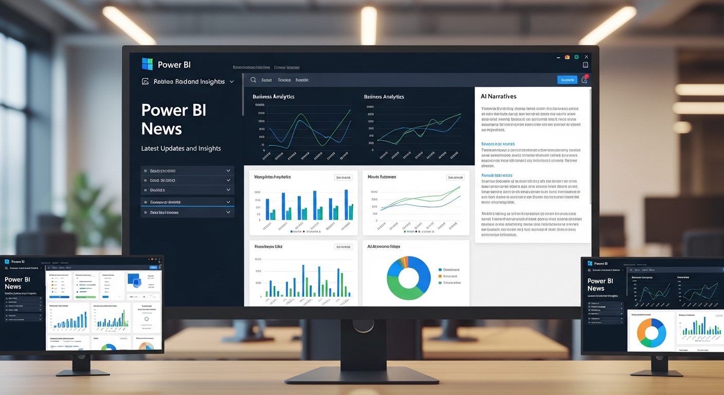
Power BI News
The March 2026 update for Microsoft Power BI brings one of the most significant sets of improvements in recent years. This release focuses heavily on artificial intelligence, enterprise-grade data modeling, cloud performance, and modern visualization tools. The goal is to make Power BI faster, smarter, and more scalable for organizations of all sizes.
Power BI continues to evolve as a leading business intelligence solution used by companies worldwide. With this update, Microsoft is clearly pushing the platform toward a future where analytics is more automated, AI-driven, and accessible to non-technical users. This news provides a complete, updated breakdown of all new features and explains what they mean in real-world business usage
Overview of the March 2026 Update
The March 2026 release is not a minor patch. It is a major platform enhancement that affects nearly every layer of Power BI, including reporting, data modeling, AI integration, and cloud performance.
Microsoft’s main focus with this update is:
- Reducing manual reporting effort
- Improving AI-driven insights
- Enhancing performance for large datasets
- Strengthening enterprise collaboration
This makes Power BI more suitable for modern organizations that rely on real-time decision-making.
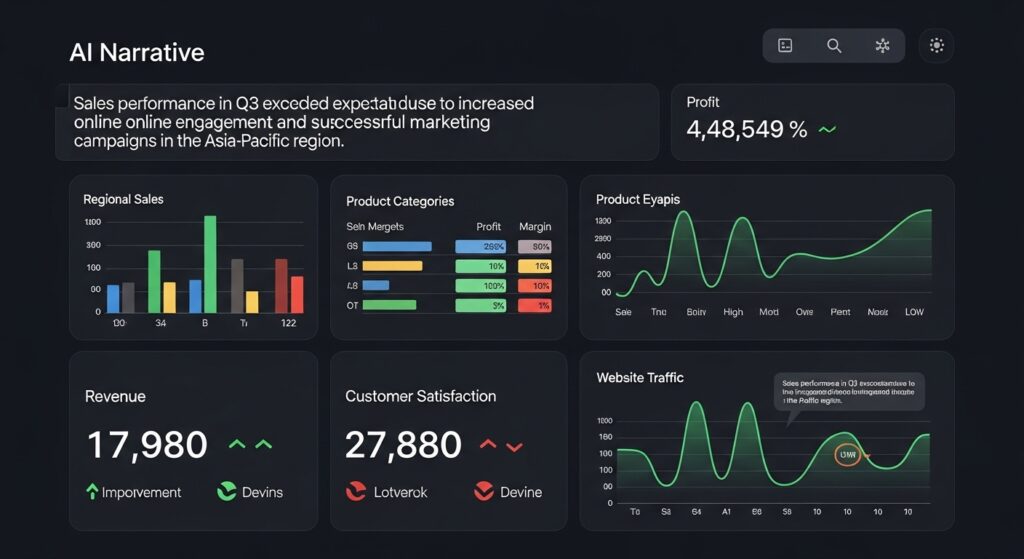
Latest AI Improvements and Copilot Enhancements
Artificial intelligence is at the center of this update. Microsoft has significantly improved Copilot to make data analysis faster and more natural. Copilot now provides more context-aware responses, allowing users to interact with reports using simple language instead of complex formulas.
It can summarize data trends, highlight key insights, and suggest relevant visualizations automatically. A major improvement is the real-time updating of AI-generated narratives. Previously, users had to manually refresh insights after changing filters or slicers. Now, the system automatically updates narratives instantly, ensuring that reports always reflect the latest data.
This improvement is especially useful for executives and business users who need quick summaries without diving into detailed reports.
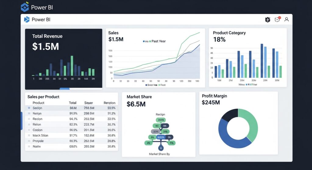
Reporting Enhancements and Visualization Improvements
Reporting has also received several important upgrades in this release. One of the key improvements is more accurate calculation of totals in table and matrix visuals. Earlier versions sometimes produced incorrect results when working with complex data models. The new system now ensures correct aggregation based on proper data logic.
Microsoft has also improved the overall visual design system. Reports now follow a more modern and consistent layout, improving readability and making dashboards easier to understand. Chart labeling has been refined as well. Overlapping issues in dense visualizations have been reduced, making large datasets easier to interpret without confusion.
Additionally, Microsoft is gradually rolling out improved dashboard responsiveness, allowing visuals to load faster even when working with large datasets.

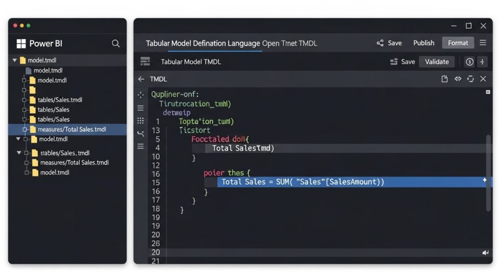
Data Modeling and Enterprise Analytics Improvements
The March 2026 update introduces strong improvements in data modeling capabilities, especially for enterprise environments. A major enhancement is improved Direct Lake performance within OneLake. This allows organizations to process large datasets without unnecessary duplication, resulting in faster query execution and reduced storage overhead.
Browser-based semantic modeling using TMDL has also been expanded. Users can now manage and edit data models directly from the browser environment, improving collaboration between teams and reducing dependency on desktop applications.
Advanced DAX functionality has also been extended, allowing developers to create more flexible, reusable, and efficient calculation logic for complex business scenarios. These updates make Power BI more powerful for large-scale enterprise data environments.
Cloud and Big Data Performance Enhancements
Cloud performance is another key area of improvement in this update. Power BI now handles large-scale datasets more efficiently within Microsoft’s cloud ecosystem. Query performance has been optimized to reduce latency, especially when dealing with high-volume data sources.
OneLake integration has also been improved, providing a more unified data architecture. This helps organizations reduce data silos and ensures consistency across departments. These enhancements make Power BI more reliable for real-time analytics, especially for enterprises dealing with continuous data streams.
New Visualization and Dashboard Features
Visualization tools have been upgraded to support more interactive and meaningful data exploration. New improvements include better flow-based visuals, enhanced hierarchical charts, and improved geospatial mapping capabilities. These tools allow users to better understand relationships between different data points.
Drill-down functionality has also been improved, making it easier to explore detailed data layers with fewer clicks. This reduces complexity and improves user experience when analyzing large datasets. Microsoft is also improving dashboard performance to ensure smoother interaction even with visually complex reports.
Latest Business and Industry Impact
The March 2026 update is not just a technical improvement—it has a direct impact on how businesses operate.
For business users, AI-powered insights reduce dependency on technical teams and allow faster decision-making. For analysts, automation reduces repetitive tasks and improves productivity. For developers, enhanced modeling tools provide greater flexibility and control over complex datasets.
Overall, this update helps organizations become more data-driven by making analytics faster, simpler, and more accessible.
Future Direction of Power BI
This update clearly shows the future direction of Power BI: automation, AI integration, and cloud-first analytics. Microsoft is moving toward a system where reports are not manually built from scratch but generated and enhanced through AI assistance.
This reduces complexity and allows users to focus more on decision-making rather than data preparation. As AI continues to evolve, Power BI is expected to become even more predictive and intelligent in future releases.
Conclusion
The March 2026 Power BI update represents a major step forward in business intelligence technology. With improved AI capabilities, stronger data modeling, better visualization tools, and enhanced cloud performance, Microsoft is positioning Power BI as a fully intelligent analytics platform for modern enterprises.
Organizations that adopt these updates will benefit from faster reporting, improved accuracy,
FAQs
What is new in the Power BI March 2026 update?
The March 2026 update for Power BI includes major improvements in AI Copilot, real-time reporting updates, enhanced data modeling with Direct Lake, better visualization tools, and improved cloud performance for large datasets.
How does the new AI Copilot feature improve Power BI?
The upgraded Copilot provides faster, more context-aware insights and can automatically summarize reports. It also updates narratives in real time when filters or slicers are changed, making data analysis quicker and easier for users.
What improvements have been made in Power BI reporting?
Reporting has become more accurate and visually consistent. The update fixes issues in table and matrix totals, improves chart labeling, and introduces a more modern design system for better readability and user experience.
What is Direct Lake in Power BI?
Direct Lake is a feature that improves performance when working with large datasets. It allows Power BI to process data more efficiently without unnecessary duplication, resulting in faster queries and better scalability.
Can Power BI now be used in the browser for data modeling?
Yes, the update expands browser-based semantic modeling using TMDL. Users can now create and modify data models directly in the browser, improving collaboration and reducing dependency on desktop applications.
What improvements were made in Power BI visualization tools?
New visualization enhancements include better flow-based charts, improved hierarchical visuals, and upgraded mapping tools. Drill-down features have also been improved, making it easier to explore detailed data insights.
How does this update benefit businesses?
Businesses benefit from faster reporting, improved decision-making, and reduced manual effort. AI automation helps teams analyze data more quickly, while cloud improvements support large-scale enterprise analytics.
Is Power BI becoming more AI-based?
Yes, Power BI is increasingly becoming an AI-driven analytics platform. With Copilot enhancements and automated insights, the system is moving toward reducing manual reporting and providing intelligent, real-time data analysis.